Link Box Pattern: Notes on technical implementation
There is also a PDF-version available of this guide with better styling than the basic HTML version. It may be easier to read for persons able to observe the content visually.
1. Examples
Examples can be found on the demo page: http://siteimprove-accessibility.net/Demo/Page/
2. Overview
The linkbox is not a specific element, but a service design pattern that is commonly found on modern web sites. There is an increasing need to provide graphical, card-like clickable areas that function as links to a single URL, even as the card or box combines multiple content elements within – an image, a title, a short blurp, even tags. These kinds of card do, of course, cater naturally to a mobile-first design and touch input.
Typically, such links can be found in both desktop and mobile views in search result pages and topic pages, and increasingly also on main pages where new items, blog posts, and articles are collected as grids of clickable boxes.
Although the pattern can be implemented in a multitude of interpretations, the “boxes” discussed here are specifically of the kind functioning as singular link. Boxes that rather contain links or clickable elements with a multitude of functions, are not link boxes but traditional region containers that are subject to different implementation considerations. They are, of course, a good deal easier to make accessible given that there is no need to bind all of the content to a single link.
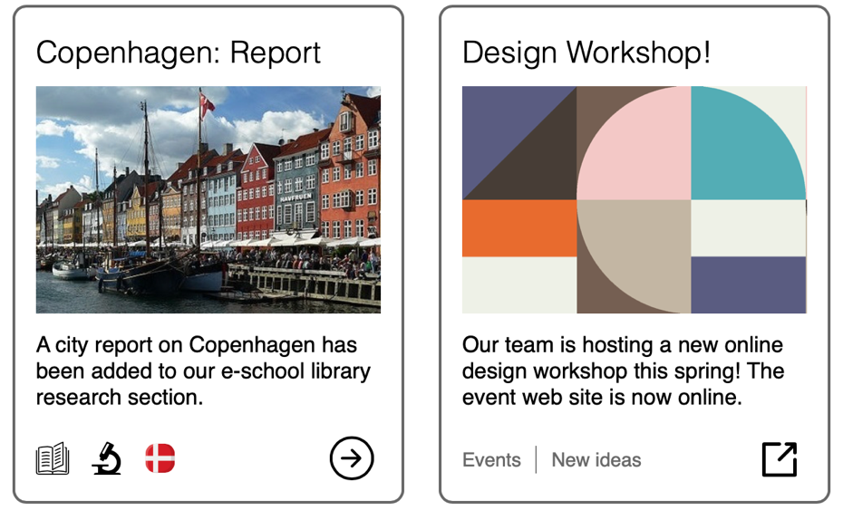
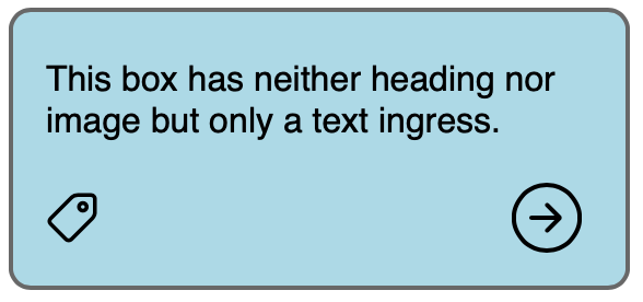
The ‘box’ discussed here usually comprises at least a title, image, descriptive text or ingress, and a graphical or textual link. There may be other components, too, and the image or paragraph text may be missing in some boxes (used within the same web site) depending on the kind of link they host.
3. Requirements
Overview
In its typical implementation, a link box is challenging for screenreader users. Often, there is either a single link (anchor) tag which encompasses the entire box — rendering the box very difficult to navigate, comprehend, and interact with when using assistive technology — or there is a series of links (title link, image link, text link, icon-as-a-link, …), all of which point at the same target without it being clear for a screenreader user whether they do indeed server the same linked target or not.
Keyboard users, in turn, may grow frustrated with the number of repeated links inside every box; or they may face unexpected focus order within the box area.
From these issues follow that the linkbox should have the following properties.
Link Box accessibility properties
- Both the keyboard (visual) user and the screen reader user perceive only one link or focusable element associated with the box. This element within the box element need not be the same for both modalities.
- A keyboard uses when navigating the page with the TAB key will find the whole box or a given part of it focused; another TAB press will move focus off the box and to the next interactive element on the page.
- The whole box area can be pointer-clicked; the click activates the box link irrespective of the click point co-ordinates.
- The box heading may or may not be the link description.
- The box image can be hidden from assistive technology as extraneous.
- The image ALT text if exposed will unnecessarily add a duplicate description for the link, which is already described by the link box heading and/or the text ingress and/or the anchor element aria label.
- Non-visual users should grasp that they are dealing with a region that is (1) actionable, but also (2) demarcated very specifically to certain start and end point, so that multiple boxes can be told apart from one another and from other page content that precedes and follows them.
These requirements are somewhat contradictory. To that end, no perfect solution to the link box design pattern exists according to the author’s best knowledge. The approach shown below will therefore contend with a number of compromises.
4. Implementation
The link boxes shown on the demo page utilize a <link-box> HTML tag, built as a Web Component whose properties can be set by attributes within the tag. The example component is one approach to tackling the link box requirement set; it is by no means the only way to build these requirements into a single element. Experienced web developers can probably come up with more elegant and succinct solutions.
Design decisions
- There is one link (anchor tag) per box: This is a normal <a> tag placed within the box itself.
- The entire box area is clickable: The element is wrapped in a container that has a click event that executes the link.
- The box is keyboard focusable only in its entirety: The container is set with a tabindex=”0” attribute that makes it keyboard focusable. Any other interactive elements within, such as the anchor tag, are, correspondingly, given tabindex=”-1”. This ensures that they cannot be keyboard focused. Hence, only the box wrapper seems to receive focus, and so all boxes can be tabbed onto and off with single TAB key presses.
- Consequently, the container has a keypress event that will respond to Enter. Like the click event, it will execute the box link.
- Users of assistive technology will perceive the box
- As a named region or a generic region called a “link box”. This is implemented with a <div> that has a role=”region” attribute, but a <section> tag could as well be used now that newer screenreaders describe named sections consistently even without the region role.
- With or without an image ALT text
- A heading (<H> tag) within the box, if the box has a title. This also exposes the link box as part of the page semantic structure and makes it easier to discover.
- The anchor tag is exposed as a link to assistive technology. It is placed as the final element in navigation order inside the container.
- Since there is no text link, the link glyph is used as an image link.
- The link is named with an aria-label. This way, it is not exposed as an image, but acts like a text link, since the image is an unnecessary detail for screenreader users.
- The aria-labeling also allows us to easily afford the link an extended description in case it is an external link or a link to a non-web-page resource like a PDF document (in which case, according to WCAG 3.2.4, Consistent Identification, the user has to be informed of the unexpected deviation of the element type’s usual behaviour on the web site.)
- Optionally, the link box can contain tags that could label the various categories to which the linked topic pertains. Adding these will increase the amount of content as well as the complexity of the element, so if tags are truly needed, one should consider whether a link box actually suffices or whether a traditional region with multiple functional parts would fit the use case better.
- The tags can be of text or image. Image tags are described for screenreaders as a single group in lieu of being presented as individual images, to keep the amount of content in the box as small as possible and hence the element as light as possible for assistive technology users.
- Text tags. in contrast, are exposed individually but are wrapped inside their own “Tags” region within the box. This is done to show an alternative pattern to the above.
- Many other approaches could be used as well.
Limitations
The design does impose a number of compromises that impact screenreader users.
Most importantly, the entire link box, not just the link within, remains clickable also to screenreaders. This is unavoidable, as screenreaders do send also a click event even when they are used by a keyboard, and there is no way to detect and hence block a screen reader’s click event specifically in code.
It follows that if the user clicks any non-linked segment of the box with a screenreader, the link will activate. This is not at all desirable. To mitigate the usability problem, the box container/region is named specifically with the prefix “Link box”, which should grant it the WCAG 4.1.2 Role determiner. With this naming mechanism, the user upon entering the box should be better prepared for and aware that the element has an unusual role, namely, that it is interactive as a whole.
A method one might try to use to solve the problem is to apply a pseudo link element to the anchor element, and spread the pseudolink across the entire link box, so that no click event need be assigned to the box container for mouse or keyboard. However, this approach has the same problem as above: The screenreader’s click will activate the pseudolink if triggered under its coverage area even when the screenreader has not focused the anchor element from which it is spread.
Example Component
The tag has the following attributes, with optional attributes in square brackets, to cover the above properties:
- title-text=”..” – Visual title of the box
- [box-sc-label=”..”] – Box aria-label for screenreader
- [h-level=”…”] – Title HTML Heading level
- link-target=”…” – Link URL
- link-sc-label=”…” – Link aria-label (mandatory because there is no other accessible name for the link)
- [img=”…”] – Image path (src), if an image is to be included
- [img-alt=”…”] – ALT-text for image. If empty or missing, marked decorative
- [text=”…”] – Text content to be placed below the image
- [ext-link] – If present, link icon and description are adjusted to point at external resource
- [shadow] – If present, element built as Shadow DOM, otherwise as normal Web Component
- [tags=”tag1, tag2, …”] – If present, element built with tags at the bottom; the tags have to be pre-defined so that their label and possible image is known.
- [tag-style=“image” | “text”]: Sets the tags style; defaults to text.
Note: The Safari browser has multiple issues with Shadom DOM elements. These persist as of Safari 14.0.1
- The Web Component tag needs tabindex=”-1” (see example 1: Copenhagen), or Safari 14 will render the box focus indicator incorrectly.
- Shadow DOM elements also cause the VoiceOver screenreader to completely break if the element is inserted inside a tag that has aria-modal=true.
Alkuperäinen versio: Tero Pesonen / Siteimprove
Luotu: 4.3.2021