Accessibility of a PowerPoint file
On this page
- PowerPoint: a presentation or an online publication?
- Creating a PowerPoint file to be published online
- The accessibility of a PowerPoint presentation can be checked
PowerPoint: a presentation or an online publication?
PowerPoint is usually used to create slideshows to support oral presentations. However, it is also often used to create other contents, and not all uses of it have anything to do with giving presentations.
Many accessibility aspects apply to both presentations and files. For example, colour contrasts, clear language and an appropriate font size are essential in both.
On the other hand, there are also aspects related to only one of the two categories.
For example, alt texts provided for images are unnecessary in a presentation situation but necessary in a file distributed online. What is important in a presentation situation is to think about how the slides are represented in the presenter’s speech: the contents of the slides must be conveyed to even those who cannot see them.
This set of instructions focuses on the accessibility of PowerPoint features and does not comment on presentation situations. However, when working with PowerPoint, you should keep in mind whether you are creating a presentation, a file or both. PowerPoint can also be used for presentations that combine slides and audio or video.
Creating a PowerPoint file to be published online
Some PowerPoint presentations are intended for downloading online without any oral presentations connected to them. You should make sure that the contents of the file are also accessible and understandable to people who examine them by means of assistive technology (e.g. a screen reader), for example. The same applies to files used to support a presentation when they are distributed online.
The following paragraphs detail what should be taken into consideration when creating a PowerPoint file that meets the accessibility requirements. The instructions herein are compiled for the PowerPoint 2016 program, but they can be applied to PowerPoint 2010 and all newer versions as well. The display view may be slightly different in different versions.
Use structures correctly
Correctly used structures support the visual appearance. For example, this means that text sections that look like headings are also marked with the heading tag for users who are unable to see. Office programs create structures “under the hood” automatically, provided that the user knows how to use the tools provided in the programs.
Remember to give your slides headings
Each slide of a presentation must be given an individual and descriptive heading. Unlike in MS Word, in PowerPoint you select a layout and visual appearance instead of a style for each slide. As such, you should pick a slide template with a heading field from the selection, whereby each slide will also have heading information.
Sometimes, you will need several slides for discussing one matter. In such a case, numbering is a great solution, e.g. ‘Important details 1/3’, ‘Important details 2/3’ and ‘Important details 3/3’.
The headings and contents of slideshows can easily be examined in the Outline View. You can find the Outline View in the ‘Show’ tab under ‘Show’ > ‘Presentation Views’ > ‘Outline View’. If necessary, you can also hide headings and other content elements with the ‘Selection Pane’ function.
Create lists and tables with tools
If your presentation features lists or tables, you should always create them with PowerPoint’s own tools. That way, the items will have the correct structure tags, the information of which will be conveyed to all users.
The list tool can be found in the ‘Paragraph’ section of the ‘Home’ tab. You can use the list tools to change the visual appearance of the bullets and numbering and the listing levels in a variety of ways. However, you should avoid using many nested lists, as they are difficult to perceive for those using aids.
- That means lists like this,
- where the list has a sublevel
- which has yet another sublevel.
- where the list has a sublevel
You can create a table by using the ‘Insert table’ function found in the ‘Insert’ tab. You should mark the top row of the table as the heading row. As with Word, you must use tables in PowerPoint only to present information. For structuring the text, you should instead use text boxes and other content elements.
Images and colours in PowerPoint files
You can use colours and figures to enliven your presentations, while images often provide an easy way to illustrate things. However, when using colours and images, you must keep in mind that not everyone receives necessary information through them. All the information that is provided through images or colours should also be provided in text. If you add embedded multimedia elements to your presentation, such as videos, you must take the accessibility of those elements into account as well.
On another note, excessive use of colours, images and shapes can easily make for restless and hard-to-understand presentations. You should avoid placing text over images, as well as heavy use of different colours and fonts. Remember, clarity and understandability are key here as well!
Sufficient contrast is defined with numbers
The accessibility requirements stipulate that there must be a sufficient level of contrast between texts and images containing text and their background. Many people have difficulties with distinguishing colours that have a very similar level of darkness. Accordingly, contrast is indicated as the relation of the difference in the degree of darkness between two colours or shades. The lowest contrast (no contrast) is 1:1, i.e. the colours have a matching level of darkness. The largest contrast difference is between black and white, 21:1.
The accessibility requirements state that the contrast difference between the text and the background must be at least 4.5:1. This requirement is slightly less for larger texts (at least 18 p) and graphical elements such as various graphs, 3:1.
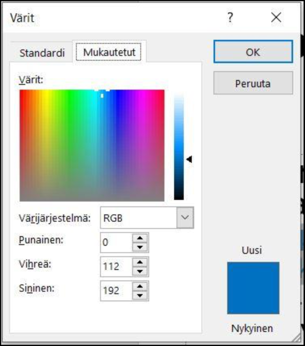
There are online tools available for checking contrast levels. In order to use them, you have to know the HEX or RGB value of the colour. These values can be used to determine colours in HTML code. In PowerPoint, you can see the RGB value of your selected colour by selecting ‘More Colours’ in the colour menu and then ‘Custom’ (image below). One good English-language tool for checking contrasts is the WebAIM Color Contrast Checker.
PowerPoint provides a wide selection of layout templates. However, accessibility is not always taken into consideration in these templates. If you have any doubts about the sufficiency of your colour contrasts, you should check them. For example, the contrast between black and white or dark blue and light yellow is sure to be sufficient.
Adding alt texts
The accessibility requirements state that the contents of images must be explained in text for people who are unable to see images. The contents of the image can be described in the text, a caption or a so-called alt text (or text equivalent) attached to the image. The image and the text should form an understandable whole.
You can easily add an alt text to every image in PowerPoint. The alt text is not shown in the slides, but it is conveyed to screen reader users. Additionally, in situations in which an image fails to load due to a poor internet connection or other reasons, the alt text can be shown in place of the image.
An alt text is provided in the 365 and 2019 versions as follows:
- Move the mouse cursor over the image and press the secondary mouse button.
- Select ‘Edit Alt Text’, which will open the ‘Alt Text’ window with the following question: “How would you describe this object and its content to someone who is blind or low vision? 1–2 detailed sentences recommended.”
- Describe the essential contents of the image in brief in the white text field. End the text with a period.
- If your image is purely decorative or the caption text contains all the essential information, you can mark the image as decorative.
An alt text is provided in PowerPoint 2016 as follows:
- Add an image to a slide, e.g. by clicking ‘Pictures’ in the ‘Insert’ tab.
- Move the mouse cursor over the image and press the secondary mouse button.
- In the menu that opens up, select ‘Format Picture’.
- Select the ‘Size and Properties’ tab.
- Select ‘Alt Text’ from the list.
- Enter your alt text into the ‘Description’ field, end the sentence with a period. The ‘Title’ field can be left empty.
A good alternative text is a concise summary of the essential information of the image that cannot be received without seeing the image. If coming up with an alternative description feels difficult, one viable strategy is to think about how you would explain the essential content to someone over the phone.
If the image is illustrative or merely decorative, there is no need to spend a lot of time on its description. Describing the essential contents in a couple of words will suffice. On the other hand, an image such as an extensive process diagram or infographic can require such a long alt text that it may be more sensible to provide the information content in the text itself.
In the more recent 365 and 2019 editions of MS Office, images can also be marked as decorative. In particular, decorative patterns, illustrations used for enlivenment and similar images should be marked as decorative. The newer versions also have an ‘Automatic Alt Text’ function that creates image descriptions automatically if you do not write them yourself. Unfortunately, for the time being the AI is not very good at writing descriptions, so this automatic function should be avoided!
Group visual elements into one image
The ‘Draw’ menu located in the ‘Home’ tab of PowerPoint can be used to select various shapes and use them to create elements such as different graphs, mind maps or other visual presentations. PowerPoint treats each element as an individual image, so in principle, you have to provide alt texts for all of them. However, a more user friendly solution is to group the elements into one image, save the group as an image, remove any non-integral elements and provide one good alt text for the image. This method also ensures that the file can be successfully converted into a PDF file.
Check the reading order of the elements
A reading order checker tool is provided especially in PowerPoint. A PowerPoint slide often features several elements, such as a heading, a text and elements such as images or several text boxes. A seeing reader can determine the correct reading order from visual cues. It is important to check that the reading order of the elements set for users of aid devices corresponds with the visual layout.
To clarify, reading order refers to the order in which an aid such as a screen reader conveys the contents of the slide to the reader. For example, in a slide with a text field and an image with a caption, the reading order could be as follows: 1. slide title 2. slide number, i.e. which slide is being shown 3. primary text content 4. image 5. caption.
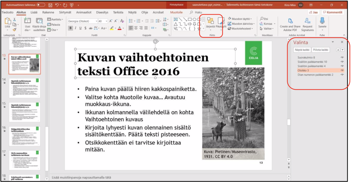
The reading order can be checked with the ‘Selection Pane’ function as follows:
- In the ‘Home’ tab, click the ‘Arrange’ button. A dropdown menu will open. In the menu, select ‘Selection Pane’, which will appear on the right side of the view (image below).
- The Selection Pane will list the elements of each slide.
- The reading order of the elements is ascending, meaning that the first element read is the bottom one, usually the slide title.
- When you click the name of an element, the program will highlight the corresponding element in the slide.
- You can change the reading order by dragging or moving the elements into a different order.
- You can also use the Selection Pane to hide elements by clicking the eye symbol next to each element. This will make the element invisible, but it will still be read to screen reader users.
File properties
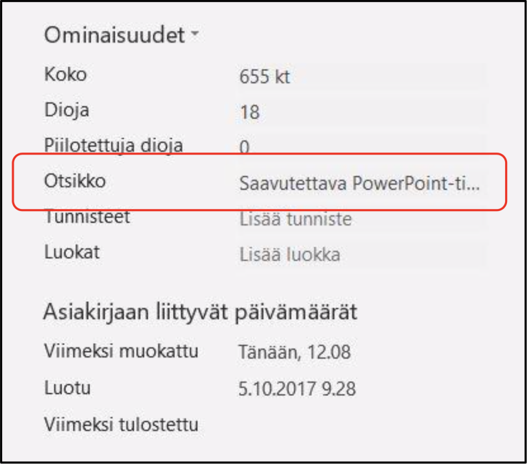
As with all documents published online, PowerPoint presentations also require a title to be provided in the file properties. Note that the heading of each slide is not the same as the title of the entire document. The title is part of the meta data of the entire document. In addition to a title, you can provide details such as the author or key words in the ‘Properties’ menu.
The newest versions of PowerPoint (365 or 2019) are able to enter the main title of the first slide into this field. In older versions, such as PowerPoint 2016, you must remember to provide a title yourself.
- In the selection ribbon on the left, open the ‘File’ menu.
- In the ‘Info’ tab, go to ‘Properties’ on the right side.
- One element listed in the properties is ‘Title’. If the file does not have a title yet, this section will say ‘Add title’.
- Move your cursor to the field and enter a descriptive title for the file (image below).
- If the file already has a title, e.g. if you are using your organisation’s own document template that has a title, such as “presentation template”, replace it with a new title.
Remember to provide a good file name as well
Be sure to give the file a good and clear file name. A good name indicates what the presentation is about. For example, the main title of the presentation is often a good file name. An understandable file name is important to people who download the file and possibly search it later on their device. The file name and the document title may be similar but do not have to be the same.
You should save your PowerPoint files in the format of a PowerPoint presentation (*.pptx). Features such as the built-in accessibility checker do not work in the older PowerPoint 97–2003 presentation (*.ppt) format.
The accessibility of a PowerPoint presentation can be checked
Once you have completed your PowerPoint presentation, check and verify its accessibility. The MS Office programs have a built-in function for checking a portion of potential accessibility problems. In addition to the automatic check process, you must check certain aspects with your own eyes.
Accessibility Checker
PowerPoint features a function for checking the accessibility of the document. This function is called the Accessibility Checker. It is capable of detecting plenty of accessibility errors and issues, but not all of them. The function can be found via the ‘Review’ or ‘File’ menu. The Accessibility Checker can only be used on files in the .pptx format. If PowerPoint states that the file is being edited in the so-called compatibility mode, it is in an older file format, usually .ppt.
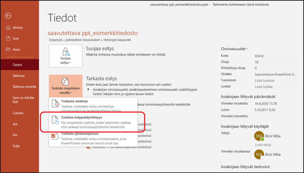
You can use the Accessibility Checker as follows:
- Open the ‘File’ tab at the left end of the tool row.
- The ‘Info’ section features the ‘Check for Issues’ button.
- Open it and select ‘Check Accessibility’ in the dropdown menu (image below).
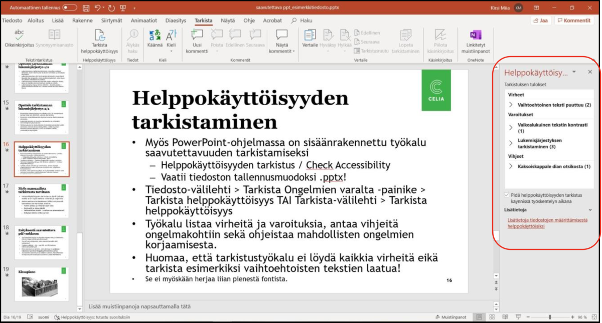
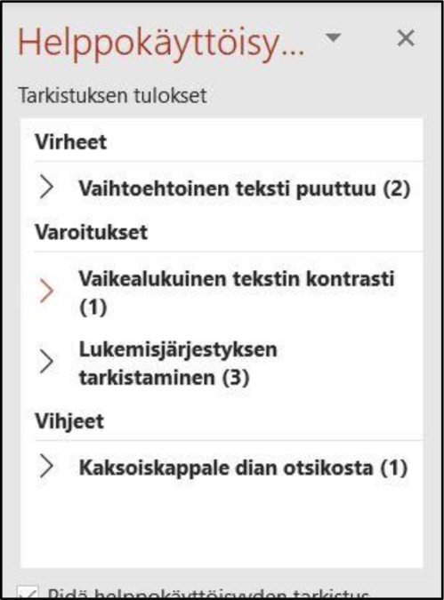
- The Accessibility Checker window will appear on the left side. The check results show any errors and warnings (image below).
- For more information about the results, click the name of the element on the results list. PowerPoint will point out the erroneous item and tell you why the issue should be remedied, providing instructions. The program also issues warnings and gives tips (detailed image below).
- Correct all direct errors at least.
Keep in mind that the checker does not find all errors, nor does it inspect the quality of the document. For example, the checker examines whether an image has an alt text, but it does not assess how good the alt text is. As such, a human review is needed as well. Newer versions of the MS Office programs have a more accurate checker that issues plenty of various recommendations and warnings. In older versions, the checker is less accurate but still useful!
Check the document yourself
Once you have run the Accessibility Checker and remedied all issues detected, check the following yourself:
- If you used images and colours, are their contrasts sufficient? If necessary, use a contrast checker tool.
- Is the font used large and clear enough?
- Has a title been assigned in the file properties?
- Does the file have a good name that indicates the contents of the file to people who download it?
Convert a PowerPoint file into a PDF file
Once you have created your PowerPoint presentation in accordance with the instructions given above and checked its accessibility, you can convert it into a PDF file. An accessible, relatively simple and checked presentation is converted into an accessible PDF, provided that it is exported into the new format as instructed.
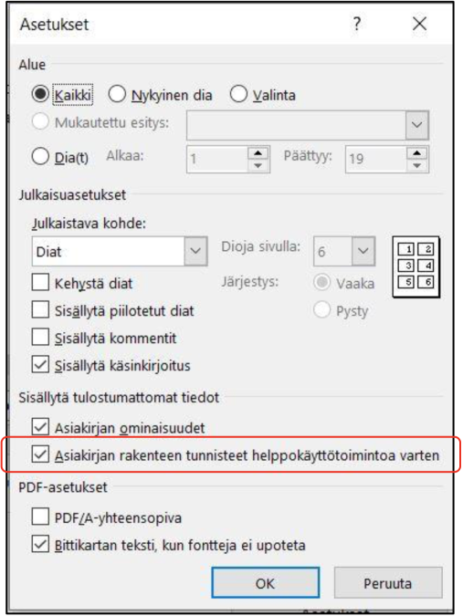
Create the PDF file either with the ‘Export’ function (‘Create PDF’) or the ‘Save as’ function. In the saving settings, select the options ‘Document Structure Tags for Accessibility’ and ‘Document Properties’ (image below). If you are using Adobe’s paid products, you can also use the Acrobat PDFMaker tool. It features more setting options, e.g. an opportunity to create bookmarks in a long file.
If the presentation and the resulting PDF is very complex and contains elements such as embedded multimedia or other special effects, you should check its accessibility separately with the Adobe Acrobat DC program.
Do not use the ‘Print PDF’ function. Instead of an accessible PDF, this function only creates an image.