Accessibility of a Word file
On this page
- Use styles to mark the file structure
- Use heading levels in the correct order
- Table of contents and cover page
- Body text and highlighting text sections
- Use tables for presenting information
- Providing alt texts for images
- Give links descriptive names
- Marking the language
- File properties
- Accessibility-related difficulties
- Give your file a good name and save it in the .docx format
- Checking the accessibility of a file
- Convert a Word file into a PDF file
This section features instructions and advice regarding how you can make an accessible Word document with the 2016 version of Word. If you are using another version of the program, you can follow these instructions even though your program version may look slightly different. The same functions and methods are provided in all versions of Word from the 2010 edition onwards.
Utilise templates
If you are able to use a Word file template the accessibility of which has been checked, utilise this option. If there is no template available or you are not sure about the accessibility of a template, you can create an accessible file by using Word’s own style options.
These instructions involve using one ready-made Word template. Only small changes have been made to the style, i.e. the normal font size of the body text style has been changed to 12.
Use styles to mark the file structure
First, design the structure of the Word file – think about what your headings will be and what heading levels you will need. A short file, such as a meeting agenda, usually does not require many headings. A longer file, such as a report, often utilises plenty of headings and several heading levels, i.e. subheadings.
Mark the structure of the Word file with appropriate styles. Use heading styles to mark headings, list styles for making lists and tables for creating tables. The styles can be found on the tool row (also called the selection ribbon) at the top in the ‘Home’ tab.
The use of styles ensures that the file is accessible
Remember that Word is not a typewriter, but a text editor. You cannot simply rely on the text looking right – you must ensure that the program is making correct markings in the file in the background. Using styles will ensure that correct accessibility-related technical structure markings are implemented in the file.
To sum up the aforementioned, even if you think that a text looks like a heading, it may not necessarily be a genuine heading. Only headings created by utilising heading styles will ensure that the Word file will be accessible.
Mark a heading as follows:
- Write the heading as its own paragraph.
- Hover the cursor over the heading or select the entire heading text.
- In the ‘Home’ tab, select a suitable heading in the ‘Styles’ section.
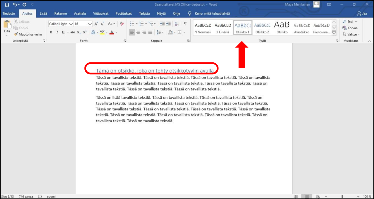
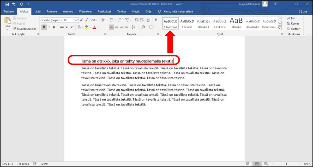
Below is a screenshot of a Word file that appears to contain a heading. The text “Tämä on otsikko, joka on tehty muotoilemalla tekstiä” looks like a heading. Its visual appearance is clearly different from the body text. However, it was created by editing the text, i.e. changing the font size to 16 and applying boldface. The style of the text is ‘Normal’, which means that it is not a genuine heading.
When you mark your Word file’s headings and other structures with appropriate styles, you make the file accessible. The styles contain information about the structure of the document, and they are also used to convey the structural information to readers who use aid devices. Correctly marked headings also help readers using aid devices navigate the file efficiently.
If necessary, you can edit styles as follows:
- Go to the ‘Home’ tab.
- Select a style from the ‘Styles’ menu. Place the cursor over the style and press the secondary mouse button.
- In the menu that opens up, select ‘Modify…’
- Press the ‘Format’ button at the bottom of the ‘Modify Style’ window.
- In the list that opens, select the element that you want to modify, e.g. the font or paragraph settings.
- Set the properties.
- Confirm the changes by clicking ‘OK’.
Do not worry too much about finalising and fine-tuning the visual appearance of the document until the entire document is complete. Make sure that the visual appearance of the headings supports understanding the structure, i.e. that headings created with the ‘Heading 1’ style are larger in font size than headings created with the ‘Heading 2’ style. Be sure to also make sure that the headers stand out from the body text.
When you use styles, modifying the visual appearance is quick and efficient. By changing the settings of a style, you can modify all sections marked with the same style at once.
Use heading levels in the correct order
Mark all of the headings of the text with heading styles. Use the heading levels in a logical order, i.e. mark main headings with the ‘Heading 1’ style, subheadings with the ‘Heading 2’ style and subheadings of subheadings with the ‘Heading 3’ style.
Do not skip heading levels, e.g. so that a subheading following a ‘Heading 1’ is marked with the ‘Heading 3’ style. Of course, there can be consecutive headings in the same style. For example, the main heading of the document can be followed by several level 2 headings. Heading levels can be skipped when moving up from a subheading level. For example, this happens when a chapter ends and a level 3 heading is followed by the level 1 heading of a new chapter.
- If the Word file has no table of contents, mark the main heading of the file with the ‘Heading 1’ style and the other headings with the ‘Heading 2’ style (and ‘Heading 3’ if necessary).
- If the file has a table of contents, mark the main heading with the ‘Title’ style and the headings listed in the table of contents with the styles ‘Heading 1’, ‘Heading 2’, etc.
Write descriptive headings
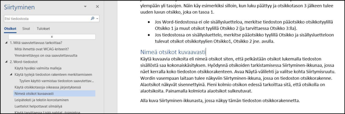
Use descriptive headings by naming them so that the reader can form an overall picture of the contents of the file from the headings alone. When checking the headings, utilise the ‘Navigation’ window, which shows you the heading structure of the entire file. Open the ‘View’ tab and select the ‘Navigation Pane’ option. The ‘Navigation’ window will appear on the left, displaying the heading structure of the file. Subheadings are indented in the view. A small triangle before a heading means that the heading has subheadings. You can close the subheadings by clicking on the triangle.
You can also check the level of an individual heading as follows: Place the cursor over the heading and press the secondary mouse button. Select ‘Paragraph’. In the ‘Indents and Spacing’ tab of the ‘Paragraph’ window, ‘Outline Level’ indicates the level of the heading.
Table of contents and cover page
You can easily add a table of contents to a Word document when the headings are marked with heading styles. When you want to add a table of contents to a document, do so with the ‘Table of Contents’ function found in the ‘References’ tab. Select a style for the table of contents. If necessary, you can also modify the settings of the table of contents.
If you create a cover page for the document, you can use a ready-made Word cover page template for the title and modify its appearance to suit your preferences. However, the text boxes of cover pages can be “floating” and not on the text level. For this reason, you must check the cover page of a PDF file converted from a Word document.
Body text and highlighting text sections
Mark all of the body text, i.e. the ordinary text of the file, with the same style, e.g. ‘Normal’. If you are not using a Word template, you should select a clear and easy-to-read font in which characters such as upper case I and lower case L or upper case O and 0 (zero) are clearly distinguishable from one another. Fonts that mimic handwriting or are otherwise playful in style are often unclear to persons with dyslexia or poor eyesight.
You should align the text to the left and leave the right side uneven. The recommended line spacing is at least 1.5. These settings are particularly helpful to persons with reading difficulties.
You should set a slightly larger space between text paragraphs in order to make paragraph changes clearly noticeable. Set the paragraph spacing by modifying the paragraph style; do not add unnecessary paragraph marks between paragraphs. (Screen reader programs may read unnecessary paragraph marks as ‘blank’.)
If you want to highlight a text section, use boldface rather than italics. Texts in italics are harder to read than ones in boldface. Avoid using ALL CAPS for emphasis, as such text is slower to read than lower case text. Do not use underscoring for emphasis, as underscored text can be confused with links in electronic files.
If you use colours for emphasis, remember that not everyone sees colours like you do, if at all. You should be particularly careful when using red and green texts, as colour blind people have difficulties with distinguishing them.
The best way to ensure that all readers will notice your emphases is to express important matters clearly. In other words, use words in addition to visual means.
Lists make it easier to browse through content
Lists are good for purposes such as describing different phases or giving instructions. Use an appropriate list style for marking lists. The list styles can be found in the ‘Paragraph’ menu in the ‘Home’ tab.
If the items on your list do not have a clear order, use an unnumbered style. Choose a bullet style that is easy to detect.
If you use a numbered list, prefer Arabic numerals: 1, 2, 3. Screen reader programs may have difficulties with reading Roman numerals.
If necessary, use the ‘More Columns’ function
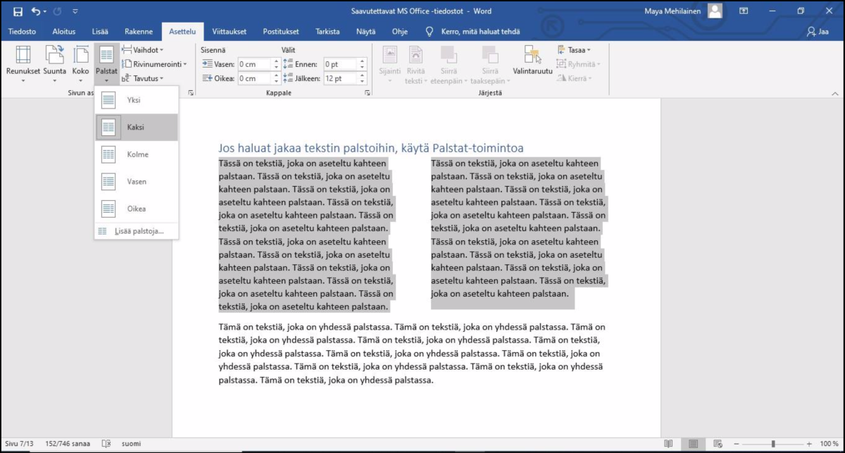
If you want to divide your text into columns, do so with the ‘Columns’ function in the ‘Layout’ tab. Select your desired number of columns. This method will ensure that the users of aid devices can read the texts in the columns in the correct order.
Do not use tables for creating text columns. Screen reader programs tell their users how many rows and columns tables have even if they have no visible borders. The information about rows and columns can make the text more difficult to understand and navigate.
Use tables for presenting information
Create tables with the ‘Insert Table’ function of Word. Do not use images created from tables, as screen reader programs are unable to interpret them. Tables created with the table tools of Word are accessible.
Add a table as follows:
- Go to the ‘Insert’ tab.
- Press the ‘Table’ button and create a suitably sized table. You can use the mouse cursor to select a suitable number of columns and rows or use the ‘Insert Table’ function and enter your desired number of columns and rows. Enter the information into the cells of the table.
- Once you have filled out the table, move your cursor to the top row of the table. In the ‘Table Tools’ tab, select ‘Structure’. Make sure that you have selected the header row.
- Next, select ‘Layout’. Activate the ‘Repeat Header Rows’ function. When this function is activated, the header row will repeat if the table is divided onto two pages.
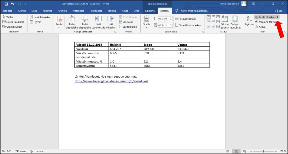
Note that you can provide alt texts for tables. Place the cursor over the table and press the secondary mouse button. Select ‘Table Properties’, and in the window that opens, select the ‘Alt Text’ tab. In the ‘Description’ field, write a brief description of what the table contains. Do this especially if the table in question is complex. (The Accessibility Checker of Word 2016 and older versions will give an error message if tables have no alt texts. The checking process is described in greater detail in the section ‘Checking the accessibility of a file’.)
Keep your tables simple. If a table becomes complex, its accessibility will be difficult to ensure. Try to divide any complex tables into two or more parts each. Prefer more rows than columns, as wide tables are difficult to read.
If your document features complex tables regardless and you convert it into a PDF file, check the tables of the PDF file and their accessibility.
Try to create your text layout by using the styles provided in Word. Only use a table for layout purposes if no style option is able to achieve your desired result. Word is not a perfect program for creating accessible content, so compromises will have to be made in some cases.
Providing alt texts for images
The accessibility requirements state that images must have text equivalents. In a Word file, this text equivalent is called an alt text.
An alt text conveys the essential contents and meaning of an image. Alt texts are needed and used by people who read the document with a screen reader program. To clarify, an alt text is not a caption that is displayed to all users in connection with the image. An alt text is a text provided for screen reader users only, and it is not conveyed to users not using a screen reader.
When creating an alt text, use language and words that corresponds with the rest of the file. Even if using a technical term feels like a good idea, do not use it in an alt text if it has not been explained earlier in the body text.
When creating an alt text, think about the following questions:
- What is the image in the document for?
- What essential information does the image contain?
- What information is not received without seeing the image?
Make your alt texts brief and to-the-point. Focus on what is essential. Do not describe the visuals or colours if they have no significance and are referred to elsewhere in the text.
In the alt text, you can name the type of image used, e.g. a photograph, a drawing or a painting. This should be mentioned at least if the image type has significance.
In the alt text, do not repeat what is stated in the body text or image caption, but provide clarification or additional information, if applicable.
How to add an alt text in Word 2016:
- Move the cursor over the image and press the secondary mouse button.
- Select ‘Format Picture’.
- In the ‘Format Picture’ window that opens up, select the third tab, ‘Layout & Properties’.
- Select ‘Alt Text’, and in the ‘Description’ field, write a description of the contents of the image. Leave the ‘Title’ field empty. Instead of reading the title, screen reader programs read the contents of the description where the image is placed in the document. End the alt text with a period.
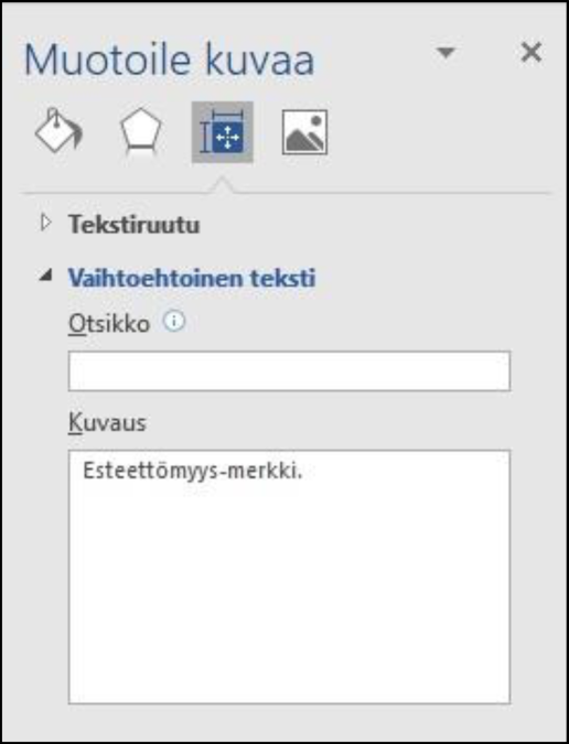
If an image in the file is completely decorative, e.g. an abstract pattern or shape not containing any information, no alt text is needed. In such cases, leave the ‘Description’ field empty. This will trigger an error notification from the Accessibility Checker, but the notification can be ignored. (In the latest versions of Word, decorative images can be marked as decorative.)
Give links descriptive names
If the text contains hyperlinks to websites, for example, make sure that the link is distinguishable from the body text. If you write a URL address or part thereof, Word usually underlines the address and colours it blue automatically.
URL addresses are often long and difficult to read, especially if they contain meaningless number and letter combinations. Edit the link text so that the visible text is easy to understand. For example: The City of Helsinki’s YouTube channelfeatures videos about Helsinki and its residents. (In this example, the actual URL address would be very difficult to read: https://www.youtube.com/channel/UCzJFvpjRB62oRoep4oRgwjg.)
However, keep in mind that it may be necessary to provide the reader with the full URL in a Word document. In particular, if it is known that the document will be printed, all link texts must be provided in such a form that they can be entered into the address field of a browser. If a URL address is short and simple, the link can be left unnamed in the body text and presented as the URL, such as www.hel.fi. An alternative method is to provide the address in parentheses or as a footnote. For example: The City of Helsinki’s website (www.hel.fi) features plenty of information about the City’s operations.
How to edit a link text:
- Enter the URL address into the text. Word usually identifies internet addresses and changes the appearance of the link.
- Place the cursor over the link and press the secondary mouse button.
- Select ‘Edit Hyperlink…’
- In the window, enter a name that describes the object in the body text in a suitable format into the ‘Text to display’ field.
- Also check that the correct URL address is displayed in the ‘Address’ field.
- Press ‘OK’. This will change the visible text.
Marking the language
A Word file must have a main language, i.e. the language in which the majority of the contents of the document are written. Usually, Word identifies the language automatically. You can adjust the language settings in the ‘Language’ section of Word.
If a file features several languages, such as Finnish, Swedish and English, the language of each section should be marked accordingly. You should check the language particularly if the proofreading function of Word shows an error (word underscored in red). It is possible that Word failed to correctly identify the language automatically.
Follow these steps:
- Open the ‘Review’ tab and select the ‘Language’ icon.
- Select ‘Set Proofing Language.’ Make sure that the language selected is Finnish or the language in which the text is written where the cursor is placed. If the language is incorrect, select the correct one.
- If necessary, you can mark sections in different languages, such as texts in Swedish. Select the Swedish-language text and set Swedish as the proofing language.
- Finally, press ‘OK’.
File properties
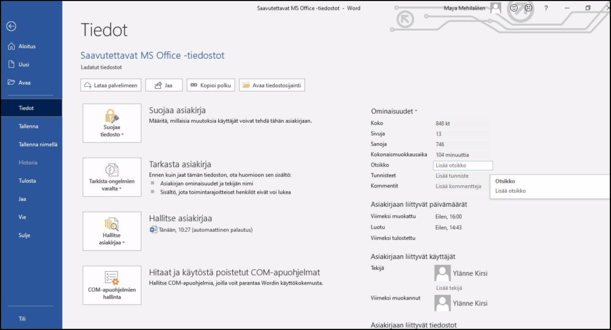
A Word file must be given a title in the file properties. The title pertains to the entire document and is not shown to the user. Add a title as follows:
- Open the ‘File’ menu, and in the ‘Info’ tab, go to ‘Properties’ on the right side.
- One element listed in the properties is ‘Title’. If the file does not have a title yet, this section will say ‘Add title’.
- Move your cursor to the ‘Title’ field and enter a descriptive title for the file. If the document has a title, check that the title is correct. Note that the ‘Title’ field is short, but you can enter a name that is longer than displayed in the field.
Accessibility-related difficulties
Accessible Word documents are easy to create from structurally simple files. Unfortunately, Word features some structures that are not accessible or cause problems when a document is converted into a PDF file. This section presents some structures that are problematic in terms of accessibility. If you use these structures and convert your file into a PDF one, the accessibility of the resulting PDF file should be verified separately.
Avoid text boxes and WordArt boxes
Text boxes and WordArt boxes implemented in Word are problematic to screen reader users, as screen reader programs are not necessarily able to access the texts within the boxes. At worst, screen readers will simply skip the boxes.
If you use text boxes, set the text boxes to the text level if possible. You should also provide alt texts for text boxes. However, do not place any important information inside text boxes, as their accessibility is uncertain.
Use headers and footers carefully
Headers and footers are difficult in terms of accessibility, as for the time being, screen reader programs are usually unable to access them or it is difficult for their users to receive information of their existence. In PDF conversions, headers and footers are not automatically marked correctly and are instead left in the background, as it were.
If your Word file uses headers and footers, do not place information important to the reader in them exclusively. Headers and footers may contain information that is repeated in the document on every page and which a seeing reader skips when it is repeated. Examples of such information include logos and contact details. However, make sure that any contact details needed by the reader are provided somewhere in the body text and that aspects such as the document date are also provided somewhere outside the header.
The page numbers of Word files are located in headers or footers. Fortunately, screen reader programs tell the user which page they are on, so these users receive the page number information.
Using colours in a document
The accessibility requirements stipulate that there must be a sufficient contrast between the text and its background. In most documents, the text is black and the background is white, whereby the contrast is as high as possible. If you use a text colour other than black or a background colour other than white, make sure that the contrast between the colours is sufficient.
- For small texts with a font size smaller than 18 points, the contrast ratio between the text and the background must be at least 4.5:1.
- For larger texts with a font size greater than 18 points, the contrast ratio must be at least 3:1.
You can calculate contrast ratios between colours with tools such as the WebAIM.org Contrast Checker: https://webaim.org/resources/contrastchecker/. The contrast requirements pertain to non-textual content as well. This means that if a document features graphs and charts that contain essential information, their colour contrasts must be taken care of. Colour must not be the only way to convey information, so a good method is to utilise various patterns in charts and graphs in addition to colours. You can print a greyscale version of the document to see whether any information is conveyed through colour alone. Exceptions to this accessibility requirement are photographs or means of presenting information in which colour is essential. Examples of these include images of thermal maps or the flags of countries.
Give your file a good name and save it in the .docx format
Be sure to give the file a good and clear file name. A good name indicates what the document is about. For example, the main title of the document is often a good file name. An understandable file name is important to people who download the file and possibly search it later on their device. Save the file in the .docx format. This file format facilitates accessibility checking.
Checking the accessibility of a file
Once you have completed your Word file, check and verify its accessibility. Use the automatic checker of Word and check certain aspects yourself. The document must be saved as a Word document (*.docx). The checker does not work with the Word 97–2003 document format (*.doc). Consequently, if you need to ultimately save the file as a .doc file, first save it in the .docx format for checking, perform any corrections needed and then save it in the .doc format.
Accessibility Checker
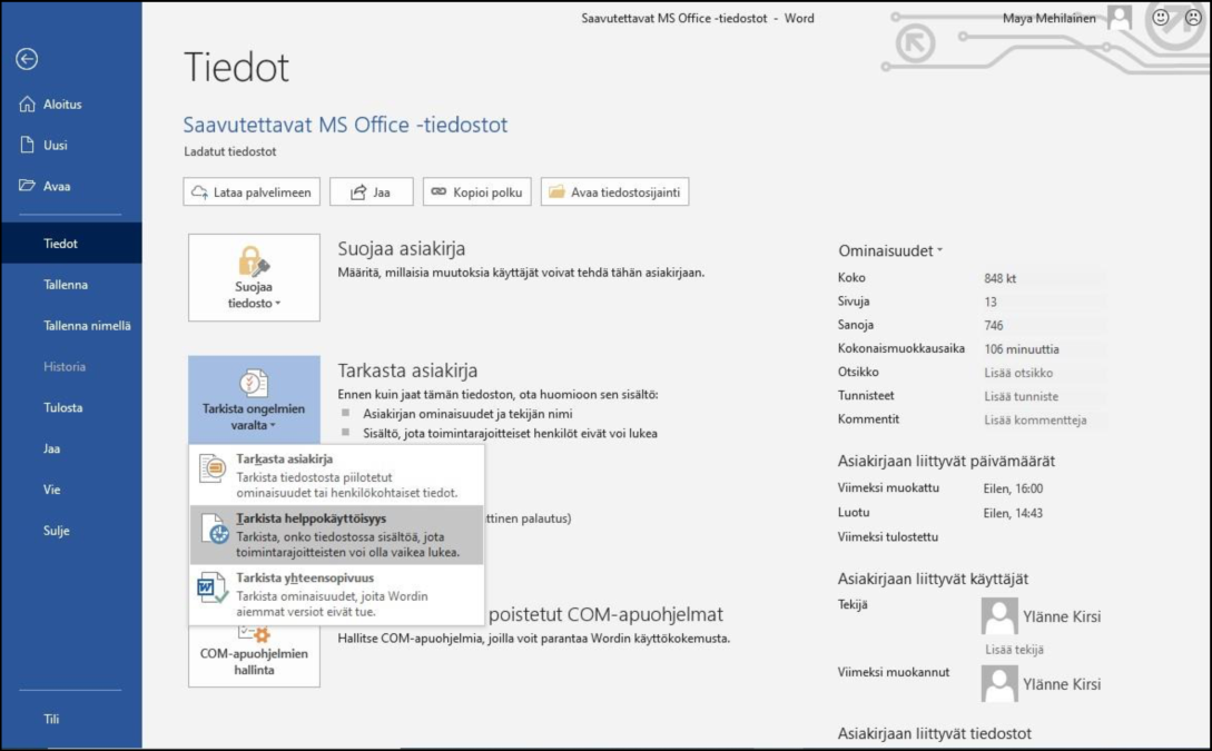
Word features a function for checking the accessibility of the document. This function is called the Accessibility Checker, and it is capable of detecting plenty of accessibility errors and issues, but not all of them. The function is located in the ‘File’ tab.
- Open the ‘File’ tab.
- Open the ‘Check for Issues’ menu. Select ‘Check Accessibility’.
- The Accessibility Checker window will appear on the right side of Word. The check results show any errors and warnings. Review all error notifications and remedy the issues. Note that Word also provides additional information about the errors listed, as well as instructions for remedying them.
One of the most common error notifications is ‘Missing alt text’. The checker tool considers all shapes to be images as well. For example, if you have used shapes to create a graph, each individual shape will trigger an error notification. One way to solve such a problem is to group all the shapes together and provide one alt text for the entire group. Completely decorative images can be left without an alt text.
Keep in mind that the checker does not find all errors, nor does it inspect the quality of the document. For example, the checker examines whether an image has an alt text, but it does not assess how good the alt text is. As such, a human review is needed as well.
Check the document yourself
Once you have run the Accessibility Checker and remedied all issues detected, check the following yourself:
- Are the headings of the file marked with heading styles? (If no heading styles are used, the checker will not detect any errors.)
- Has a title been assigned in the file properties?
- Has the file been given a good, descriptive name?
- Are all images provided with sensible alt texts? If users cannot see an image, are they able to understand its essential contents from the text?
Convert a Word file into a PDF file
Once you have created your Word file in accordance with the instructions given above and checked its accessibility, you can convert it into an accessible PDF file. If the file has a simple structure, saving it in the PDF format will suffice.
Convert a Word file into a PDF file as follows:
- Open the ‘File’ tab.
- Select the ‘Export’ function and then ‘Create PDF/XPS Document’.
- Press the ‘Create PDF/XPS Document’ button.
- You can determine a folder for the file in the window that opens. Give the file a name that indicates what the document is about.
- Before pressing the ‘Publish’ button, open the ‘Options’ menu.
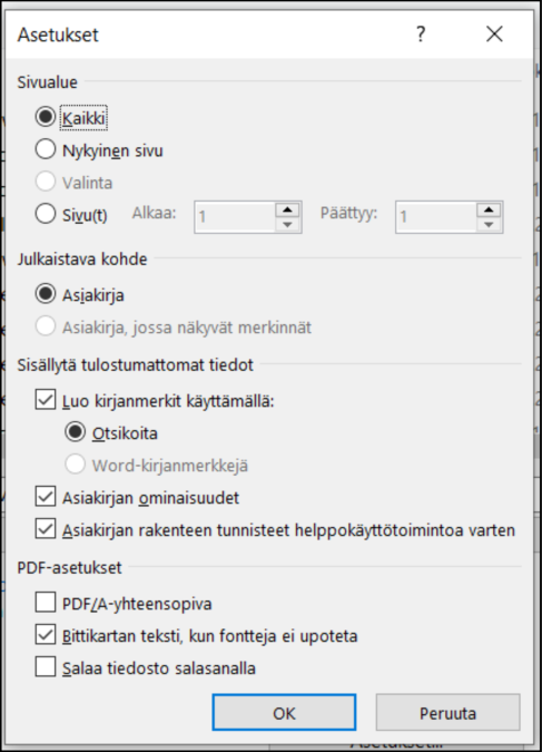
- Select the options ‘Document Structure Tags for Accessibility’ and ‘Document Properties’. (Below is an image of the ‘Options’ window.)
- Press ‘OK’ and then ‘Publish’.
Important: Do not use the ‘Print PDF’ function. This function does not create an accessible PDF file.
You can also create a PDF file with the ‘Save As’ function. Make sure that you select the options ‘Document Structure Tags for Accessibility’ and ‘Document Properties’.
Finally, check the PDF file with a PDF checking tool if the file has a complex structure and contains any of the following elements:
- text boxes
- tables with several title rows
- so-called floating elements that are not on the text level, e.g. SmartArt shapes, figures, WordArt texts, etc.
- mathematical expressions
- headers or footers. A good program for checking PDF files is Adobe Acrobat Pro/DC.
Note: If you use Adobe Acrobat Pro and your Word features the ‘Acrobat PDFMaker’ function, open the ‘Acrobat’ tab and check in the ‘Preferences’ section that you have the options ‘Convert document information’ and ‘Enable Accessibility and Reflow with tagged Adobe PDF’ selected.