Vision-related limitations

Using colours
There are many degrees of blindness or visual impairments. Some users are unable to perceive contents visually, some may perceive them with the help of aids, and others see colours but in different ways.
Problems with discerning colours are quite common. There are also cultural differences in the use of colours, which must be taken into account. For example, you can check the validity of your website’s colours here: https://color.a11y.com/Contrast/
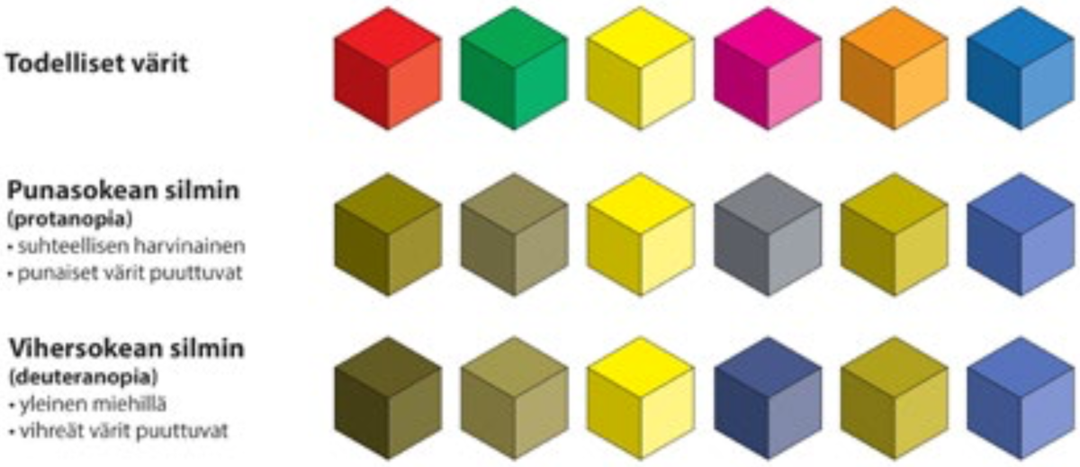
Esimerkki siitä, miten värisokeat havaitsevat värejä:
Check at least the following:
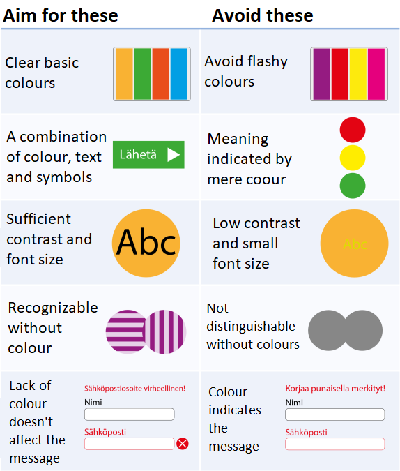
- No meanings are indicated through colour alone.
- The removal of colours does not affect the contents.
- The colours are clearly distinguishable (to colour blind people as well).
- The colours are not oversaturated (extremely intense).
- The contrast between colours is sufficient but not too high.
- The colours are not misleading (how colours are understood culturally).
- The colours are moderate basic colours.
Blind users
People who are completely blind or whose vision is so impaired that they are unable to receive information through vision alone use the website with assistive technology, such as screen readers. A screen reader is an application that converts the text on a website into speech – or in other words, reads the text content aloud.
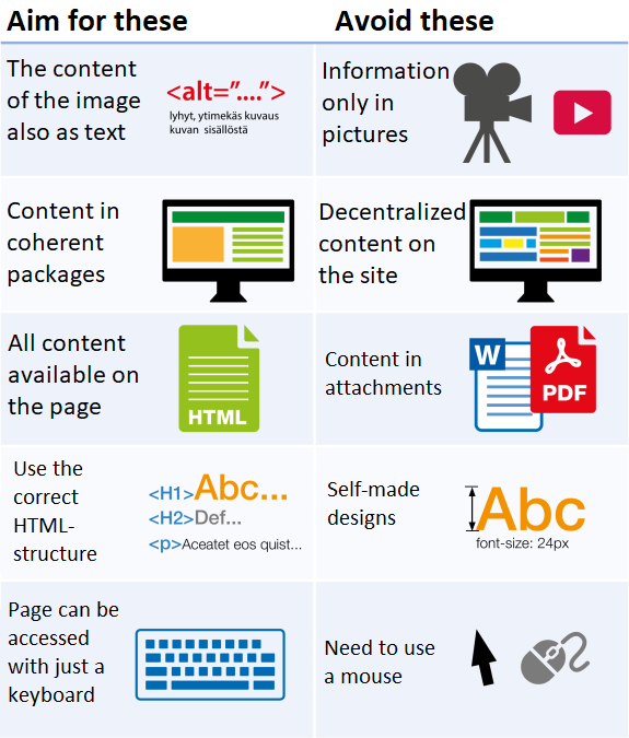
Screen readers are unable to “see” or understand image files. Alternative content must be presented for images, videos and similar files for the screen reader to read. This is done by providing an alt text for each image to describe the contents of the image. For images that do not contain information or are used for decorative purposes, the alt text can be left blank.
The screen reader will read all of the contents of the page to the reader while also making it possible to e.g. follow links or move from one heading to another.
You can help blind users by minimising contents that require listening and making it easy to find contents. Repeat the structure of the website unaltered and do not force the user to listen to the same general information on every page.
Some changes to assist screen readers cannot be implemented by content producers. Examples of these include HTML element attributes that are in the source code and steer screen readers, or jump links via which screen reader users can move directly to a certain section of the page. These technical requirements are not discussed in this content producers’ guide.
Content producers are responsible for ensuring that the contents of the page are clearly organised with good headings, and that all images have good alternative contents.
Check at least the following:
- The information on the page is available in the text.
- All images have good alternative contents, i.e. an alt text.
- The contents of the page are divided into logical subject wholes.
- All the contents are readable on the page, or if the information is in a downloadable file, the file is implemented in an accessible format, e.g. as an accessible PDF file.
- The text on the page uses the HTML structure correctly, incl. headings, lists, etc.
- No information is presented exclusively in an image or through a visual style.
- The texts of links indicate where the links lead.
- The text features enough subheadings that correspond with the contents.
- All of the contents on the page are accessible by using a keyboard.
Taking visual impairments into consideration
Users whose vision is severely impaired may be able to use contents with their vision, but in such cases, a visual style designed for people with normal vision will not work. Many people with poor eyesight enlarge the page (zoom in) or use utility programs of the operating system (magnification) or a separate optical aid.
Content producers can influence how the contents are made accessible for people with impaired vision.
Visually impaired people can be assisted by adding symbols to the page, grouping contents into clear wholes, leaving enough empty space around content elements, using clear text and making it possible to increase the font size and zoom in on the content.
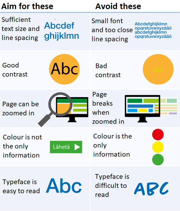
The default browser font size is 16 px (CSS pixels). Any smaller fonts should not be used on websites. As such, do not decrease the font size unnecessarily. The website may feature a larger font size for users to select. Even if such an option has not been implemented, the user can enlarge the contents of the page by “zooming in” with the Ctrl and + keys (Win) or the Cmd and + keys (Mac). Test the page to make sure that it works properly when enlarged like this.
In file-format documents (Word or PDF), the font size depends on the font used. One font may be as large at 10 px as another one is at 12 px. In printable files or presentations shown on the screen, the font size must be checked font-specifically. The line spacing of the text should be larger than the font size, at least 120%. In subheadings, the line spacing can match the font size, while in large headings, the line spacing may be slightly smaller than the font size. Be sure to also leave enough space above subheadings. The text of publications that are primarily read on-screen must be placed in one column, and the row length must not exceed 80 characters. Favouring “sans serif” fonts is recommended.
Check at least the following:
- The font used is clear and easy to read.
- The text is large enough and the line spacing is sufficient (see the instructions above).
- The contrast between the text and the background is sufficient.
- The page has a clear and logical structure.
- HTML elements such as headings are used appropriately.
- The structure of the page is not broken on the browser when zooming in.
- Colour is not used alone to give contents meaning.