Tab List Pattern: Notes on technical implementation
There is also a PDF-version available of this guide with better styling than the basic HTML version. It may be easier to read for persons able to observe the content visually.
1. Tab List is available in HDS
For users of the Helsinki Accessibility Model, the Helsinki Design System (HDS) provides an accessible tab list component that should always be used in place of a tailor-made one unless a tab list is required for a non-typical use case (some discussed below).
When to use tailor-made a tab list instead?
The term “Tab list” is defined for the purposes of this document as follows
A set of tabs:
- Divides content segments that are both visually and semantically parallel but optional to one another.
- This means that only one of the tab list content segments is open (displayed) at any given moment, yet any one of them can be opened. On the other hand, one tab content segment is always open.
- To this end, the tab list comprises tabs and a tab panel. The tab panel displays the content associated with each tab. There is no limit to the number of tabs, but from usability point of view tab lists work best when they comprehend between two and half a dozen tabs — although this, of course, greatly depends on the implementation context as well. In application-oriented designs, for instance, tab lists can be long without being cumbersome.
- All the tabs part of the list provide content that is categorically similar.
- Opening a tab will only change content, not web page context. That is, tabs are not links, but only means of exposing one of a list of alternative content segments.
The final point is important and should not be overlooked. Indeed, one must always dictate whether a web page segment functions as a tab list based on its semantics, not on its visuals. Content that might look quite a good fit for a tab list may, in fact, operate better as a list of navigation elements; conversely, content that in no way appears as a tab list may, in like manner, function best as a tab list. To be able to make this distinction is key in applying the pattern successfully.
2. Tab List or Navigation List?
The pictures below depict three web page contexts that are typical candidates for a tab list pattern.
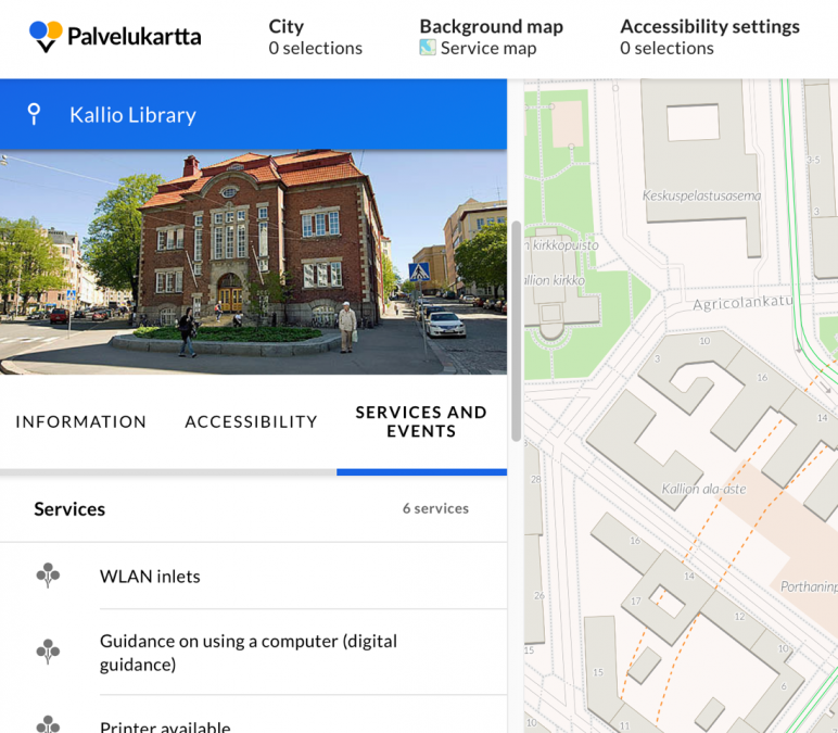
Helsinki Metropolitan Area Service Map.
The screen shows information about a location the user has found with the search function. The data which each location makes available to users are split and grouped into three sub categories (Information, accessibility, services and events), all of which apply to the same super category (service map data about this location). These categories have been implemented as tabs.
The tabs help division the display and by this means lessen the amount of content in each view, making the view more usable and accessible. Note that all the tabs could, in theory, be combined into a single display, albeit a very long one, since they are part of the same super category; one can always do this for a tab list, but not for, say, a navigation link list.
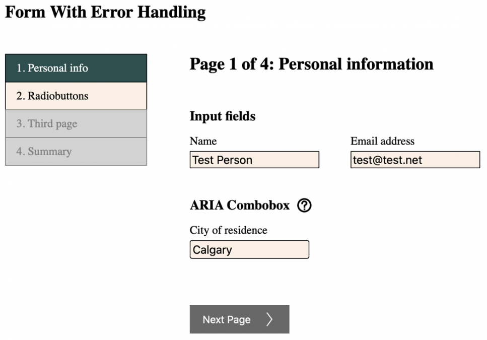
Demo page form
The form has a set of navigation links that let the user move directly to a given form page once it has been completed. This is a typical feature in multi-phase web forms and process patterns. The design both exposes (as a list, flowchart, etc.) the steps that the process will take to complete, documenting it, and packs, in the same real estate, also a navigation mechanism.
One sometimes sees the navigation mechanism implemented as a tab list. Indeed, cursorily it may seem to fill the boxes of a tab list: It divisions similarly categorized content, and there is a shared tab panel that displays each step/page. Often, though, and in the case of the demo form in particular, this pattern does not function as a tab list. The reasons is, first, that not all the “tabs” are truly optional to one another. As a matter of fact, in the case of the demo form, only one page link is initially active. More links become available as the form is filled in and each page accepted as error free. But if only one, or some, of the tabs are active, then the idea of a tab list falls short.
In other words, the tabs are not truly equal. Nor could one, thus, also place the content of all of the tabs one after the other. There is more than just content splitting a-going here. The content segments also depend on one another – they form a process where one step must be in a specific state before another can be commenced; what is more, making a change in one step (going, for instance, back to step 1 and producing an erroneous input) invalidates the later steps until the error is fixed (this is how the demo form works: Errors are checked even in completed steps).
The set of navigation links may look like a set of tabs, yet is, as we have observed above, a set of links instead. This is further compounded by the way in which the form manages keyboard focus: When a new form page is opened, focus is moved to the beginning of the page, even if the user clicked one of the navigation links. A tab when activated will never move focus off the tab list.
Clearly, a tab list is a semantical structure, not a visual structure, and must always be plied as such.
Visually untypical tab lists
It follows from our observations above that content which might not appear visually to lend itself well for a tab list may, in fact, be a good fit for tab list. Let us imagine a web page where a circle, styled like a pie chart, is used to provide information or actions related to that single slice. The pie may present ticket options, artists, development processes – anything. The pie resides on the left hand’s side, and to tis right there is a panel that displays each slice’s data or actions.
If, then, the slices can be perused or operated independently, and all of them are also available as equal options, can one proclaim that this is, as a matter of fact, a tab list, not simply a circular collection of clickable elements, visually thought it may look anything but?
The author would argue that yes, it may well be. And when one considers the implementation in service design, treating it technically (in code) as a tab list would seem the proper choice from accessibility point of view. For if a user unable to discern the pie visually observes it with a screen reader, it will appear to them no different to a “proper” tab list – since it functions in much the same way.
Of course, the visual style of this interactive pie would remain unchanged even as we build it into a tab list. The pertinent Aria techniques and keyboard navigation are unconcerned with the visuals. Indeed, it is always by its semantics that we decide how an element is described to assistive technology.
3. Aria definitions
From implementation point of view, the tab list is composed of three separate elements that each require their own WAI-Aria definitions. These are 1) a tab list, which comprises all of the clickable (2) tabs. The tabs control what content a 3) tab panel displays.
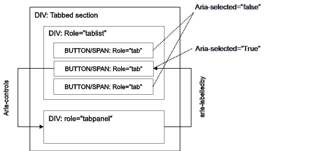
Tablist
- hosts the clickable, named tabs (often in a row).
- Tablist is usually implemented as a container div which has as its child nodes each of the individual tab elements.
- The tablist-element requires the following attribute.
- role=”tablist”
- The tablist may additionally contain
- aria-label=”…” or
- aria-labelledby=”elementID”
It is not mandatory to name every tab list. The choice is quite dependent on the context in which the tab list presides. Sometimes, a preceding heading may suffice to give the tab list its context. The user will, after all, always focus not just the tab list but a tab as well, and a tab, in turn, is always named.
Tab
- The clickable individual tab “buttons” that control what content the tablist displays in its tabpanel at each time.
- One Tab is always selected, that is, a tablist cannot be closed but a tab will always remain open; only the open tab can be altered. Although not a rule, it is good design to have the tab which is open by default placed as the first from the left.
- Each Tab element can be of any tag type. Note, though, that Tabs do not have the button role, although <button> tag can be used as the base for a tab.
- Tab requires the following attributes.
- role=”tab”
- aria-selected=”true”/”false”
- Is the tab open? Set accordingly
- aria-controls=”TabpanelID”
- ID of the element that shows the tab content and has the role “tabpanel”
- If the tab is a or other non-interactive element, it should have:
- tabindex=”0” added, so that it is keyboard focusable.
- Keyevent handlers added, so that the user can activate the tab with Enter and Space.
- Remember to make sure that the tabs are not prevented by e.g. inherited styling from showing the focus indicator for keyboard navigation
- CSS à :focus à outline, or other property
- tabindex=”0” gives the tab the system default indicator, which, if not altered, is always sufficient (see notes on the navigation menu instructions).
- Example
<span id=”tab1” role=”tab” aria-selected=”true” aria-controls=”tabpanel1″ class=”TabButton” tabindex=”0″>Tab 1</span>
Or
<button id=”tab1” role=”tab” aria-selected=”true” aria-controls=”tabpanel1″ class=”TabButton”>Tab 1</button>
- Note: Use aria-controls, not aria-owns, in a tab element. Aira-owns enforces a DOM order that will deviate from the intended tablist order.
Tabpanel
- A container that hosts the HTML which is displayed when a given tab is open.
- Tabpanel requires the following attributes
- role=”tabpanel”
- aria-labelledby=”TabID”
- ID of the tab which is currently selected, that is, which has opened this particular content and thereby gives it its name/context.
Structure (example)
4. DOM order (see picture above)
- Tab (buttons) should be child nodes of Tablist
- Tabpanel usually resides as a sibling to Tablist, although technically there is no reason why it could not be a child of Tablist. It is not, however, logically part of the tablist.
5. Keyboard Navigation and Focus Management
Implementing the correct pattern for keyboard navigation is important in tab lists. If focus is not managed correctly, keyboard users may find the element confusing or even impossible to use; this is not uncommon on the implementations one comes across on the web even in 2020.
There are two W3C-recommended kaybaord navigation modes between which the implementors can choose safely. Neither one is more accessible than the other. A third option, one that presents the tabs as normal web page action buttons to keyboard users, can also be used, albeit without official blessing by the W3C. Many users, however, will find this last pattern intuitive, especially when a tab list can assume shapes and styles quite different to a traditional tab list.
With this third option, the user need not be able to recognize that the element is a tab list. In the author’s opinion, that is good enough reason to at least consider it when thinking of how to build a tailored tablist keyboard navigation.
All three patterns can be tested on the demo page (URL below).
Automatic Tab Selection
- The user focuses the tablist with the keyboard TAB key when navigating along the web page.
- The open tab can be changed by using the keyboard arrow keys (left / right).
- Each left/right key press at once activates the tab to the left or right, displaying its tabpanel content; if the tab is the leftmost or rightmost one, the selection hops to the opposing end of the tab list and so can loop inside it.
- The user cannot not open tabs when navigating the tab list. Therefore, Enter/Space have no function.
- Pressing the keyboard TAB key again will move focus off the tab list to the next interactive element on the page.
- If tabpanels can be slow to display or bandwith is a cost, this navigation mode can incur a performance/bandwith penalty, as reaching a tab not active by default requires that all tabs between the active and the desired one must be activated one by one till the desired tab is reached.
Manual Tab Selection
- The user focuses the tablist with the keyboard TAB key when navigating along the web page.
- The user can now observe two facts about the tab list:
- Which of the tabs is active (open)
- Which of the tabs has the keyboard focus. Initially the focus is on the active tab.
- The user can now move the keyboard focus along the tab list, from one tab to the next, using the left/right arrow keys. As with Automatic Activation above, the focus will loop inside the tab list, from one end to the other.
- If the user presses Enter or Space, the tab which at that moment has the keyboard focus is activated. The user can open additional tabs at will by moving the focus and activating a new tab.
- Pressing the keyboard TAB key again will move focus off the tab list to the next interactive element on the page.
- If tabpanels can be slow to display, this navigation mode precludes unnecessary tabpanel loads and so gives good performance and minimizes bandwith expenditure.
Manual Tab Selection: Algorithm
Prerequisites: The tab element can be in one of the following four states, each of which must be visually distinguishable. The tab can be visually:
- unselected and unfocused by the keyboard
- unselected but focused
- selected (tabpanel displays this tab’s content) but unfocused
- selected and focused
Procedure:
- Set all tabs except the selected one with tabindex=”-1” and style #1.
- Set the selected tab with tabindex=”0” and style #3. à NOTE: One tab is always open when the tablist is rendered.
- If the pre-selected tab receives a CSS :focus state, set its style to be #4.
- is the same as document.activeElement === tab, in JS.
- Tabs respond to keyevent handlers:
- If “left” or “up” arrow keys are triggered
- Set the tab with style #2.
- Update the preceding tab’s style as either #1 or #3 depending on whether the tab is selected (open) or not.
- If the current tab was the first tab in the tab list, the preceding tab is the last tab of the list (that is, loop inside the list).
- Move focus to the preceding tab (with e.g. JS DOMNode.focus())
- If “right” or “down” arrow keys are triggered
- apply the step 4, only to the opposite direction.
- If “TAB” key is triggered
- Do nothing. The user will move off the list.
- If “Enter” or “Space” is triggered, and the tab is not already selected
- Set the tab’s style to #4.
- Give the tab tabindex=”0”
- Give the tab that was previously selected tabindex=”-1”
- Give the tab that was previously selected style #1.
- If the tab receives a click event, execute 4.d from above.
- If “left” or “up” arrow keys are triggered
Automatic Tab Selection: Algorithm
The algorithm is similar to the manual selection otherwise save the following: When the user pressed an arrow key, execute step 4.d immediately. Enter/Space are unheeded.
Examples
https://accessibilitydemo.net/
Tabindexing on the W3C patterns: Why?
When the user moves along the page using the TAB key, and the focus thus eventually lands on the tab list, the correct tab element (aka button) automatically receives focus. Now, when the user engages the arrow keys, the correct next or previous tab is focused. If a new tab was activated, its tabindex, too, is updated; and so if the user now leaves the tab list and then return to it, the correct tab button is again focused (the one that is active and was, in turn, given tabindex===”0”).
Since only one tab ever has tabindex 0, and the others tabindex -1, the correct tab is perforce focused, and the tabs’ key event handlers need not worry wherefrom the focus arrived, or whereto it goes. They only need to know what to do if the user presses arrow keys or Enter/Space. That is, they know that they will only ever receive these key events if they are being focused, as they cannot be ‘illegitimately’ focused.
Using tabindexes therefore simplifies the implementation and makes it work ‘passively’ correctly.
Alkuperäinen versio: Tero Pesonen / Siteimprove
Luotu: 4.3.2021