Navigation Menus: Notes on technical implementation
There is also a PDF-version available of this guide with better styling than the basic HTML version. It may be easier to read for persons able to observe the content visually.
Quick reference
- If the menu is built from an element that is not a native <button> tag, you may have to apply all of the below attributes marked as SPAN before you apply the attributes marked as BUTTON; if, however, the menu button is a <button> tag, you only need to consider the attributes marked as BUTTON, since the built-in button tag already provides the aforementioned functionality.
- SPAN: The menu button (“burger button”, Dropdown button, …) requires the following Aria-attributes
- Always: Role=”button”.
- Never: role=”link” or an anchor <a> tag. A menu is never opened from a link.
- SPAN: The menu button requires the following attributes to enable visual keyboard-only use without assistive technology:
- Always: tabindex=”0”: This tells the browser that the tag is interactive and hence focusable.
- Always: Key event handler (onkeydown or onkeypress) mapped to Enter and Space keys (keycode 13 and 32), to mimic a button. In Javascript, event.preventDefault should be used to stop e.g. Chrome from scrolling the window on a space key press.
- BUTTON: The menu button (“burger button”, Dropdown button, …) requires the following Aria-attributes
- Always: Aria-expanded=”true”/”false”
- Always: Aria-haspopup=”true”: With this attribute, assistive technology will describe the element as providing a menu. The attribute is unrelated to pop-up dialogs despite its name.
- Possibly: Aria-label=”description”: Provide the screen reader user with a label in case the menu element has no textContent or innerHTML that gives it a name (e.g. <button><span claas=…>description</span></button> has a textContent and so needs no aria-label).
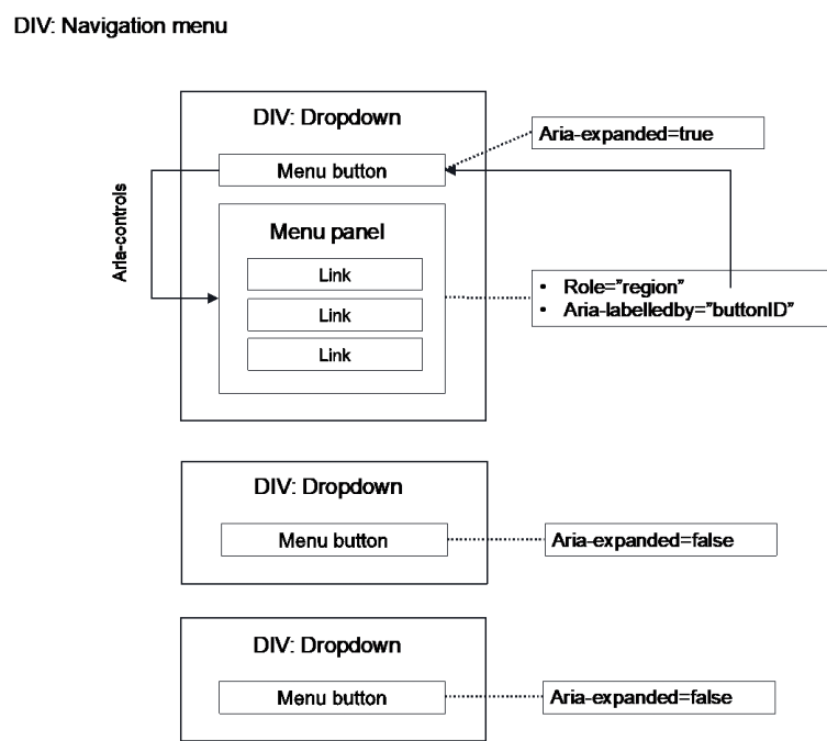
- ALL: Non-mandatory, but recommended: Define the menu content (menu panel) as a section tag or a tag with a role=”region” attribute, and give the tag either aria-label=”Menu” (or a more specific name for a particular menu amongst many), or aria-labelledby=ID (where ID is the menu button).
- Submenu of a navigation/dropdown menu
- Submenus may be implemented recursively by the same pattern as above, so that a submenu entry is a menu button, too.
- Alternatively, submenus can be implemented as accordions (see more info in training slides).
- Often, both work fine for assistive technology users. Which one to choose? If unsure, go with the one that more closely corresponds to the visual style to which the menu conforms: An Accordion for expandable, single-column menus, and a menu button for submenus that offer their own dropdown menus. A third option is to only ever use the menu button pattern for the primary navigation menu button(s) so that all navigation submenus are accordions inside the menu. This is easy for screen reader users to follow.
- An accordion is built without aria-haspopup. It has only aria-expanded=true/false.
- NOTE: Focus/navigation order within the menu should be specified before implementation, so that the DOM order can be built accordingly. This can be taxing to fix afterwards, if the DOM order and CSS rely on one another heavily.
Explanation: Menu button pattern
- Role=”button”: Native HTML components will automatically announce their role/type to assistive technology. That is, a button will proclaim to a screen reader, “I am a button”, by which means the SC can describe the element correctly to the user. However, when a span or div is tailored as an element that corresponds to a native element type, screen readers will not automatically be able to deduce that functional relationship.
It follows that although a span button may look and act like a button, assistive technology will not usually recognize its button-like status. The tag will therefore have to describe its type unambiguously. For example, a <span> or <div> that acts as a button needs role=”button” added. Many other Aria roles exist for similar mapping to standard HTML element types.
- Aria-expanded=”true”/”false” designates for assistive technology whether the content which the button controls is expanded or open (=“true”) or closed (=“false”). The attribute is used with accordions, burger menu buttons, dropdown menu buttons, pop-up dialog triggers (when the dialog is NOT a modal but acts like an accordion), and other similar cases where a button will a) expose or hide content that instantly follows in DOM order but b) where the exposed content will not capture focus like a modal would.
- Notes:
- The attribute is assigned to the element which triggers something to expand, that is, the button itself; it is NOT assigned to the content which is shown or hidden (e.g. the menu panel div).
- Screenreaders will announce the aria-expanded status. It is therefore unnecessary to describe the element’s status in its label:
- Notes:
- So, this suffices:
- <button aria-expanded=”false”>Menu</button>
- <span id=”menu_button” aria-label=”Menu” aria-expanded=”false”><img class=”menu_glyph” …></img></span>
- But this is redundant:
- <button aria-expanded=”false”>Menu (closed)</button>
- <button aria-label=”Menu, closed.” aria expanded= ”false”> Menu </button>
- If this accidentally happens, though, it is not a big problem.
- Aria-haspopup=”true”: With this attribute, assistive technology will describe the element as one that provides a menu. The attribute is unrelated to pop-up dialogs despite its name. Instead, it pertains to pop-up “dropdown” menus and content that semantically behave in a menu-like fashion. It has two variations: “menu” and “listbox”.
“Menu” is synonymous to Aria-haspopup=”true” (and the two are therefore interchangeable.) It designates a “navigation” or dropdown “action” menu that is typically populated with links or submenu buttons. A passive informative popup is better opened with a simple aria-expanded (see above); modals, in turn, need neither aria-haspopup nor aria-expanded, as they transit focus to a separate context that then describes its status itself by a standard modal pattern. However, some screenreaders do now also support aria-haspopup=”dialog”, which denotes a modal-like context.
A “burger” button that expands a navigation menu, or dropdown menus in a navigation banner, are the archetypical use cases for aria-haspopup=”true” (or “menu”).
The ”listbox” parameter is used with comboboxes, the implementation details of which are beyond this document.
- Aria-label=”description”, provides the element with a label which assistive technology will read out to the user when the element is focused. It is an alternative to using aria-labelledby=”ID”, where the description is rather derived from the label of the element whose ID is referenced. Note that aria-label will OVERRIDE any other accessible name the element may have. So, if the node also has textContent or innerHTML (even with childNodes), those are not read out. For instance:
- <a href=”…” aria-label=”Link to X (opens a PDF)”>X</a>
Here the SC will describe the link as, ”Link to X (opens a PDF)”, not “X”, nor “Link to X (opens a PDF), X”, since the aria-label replaces any other labels.
- NOTE: if the element has an additional aria-describedby=”ID”, that description, derived from the reference, WILL also be read, as the purpose of aria-describedby is to endow the element with additional information beyond its name or label (e.g. instructions, etc.). In a more technical sense, aria-describedby is not the element’s accessible NAME, and is hence not negated by aria-label (or aria-labelledby). It is, thus, normal to use aria-label together with aria-describedby; this can be particularly effective in modals, but that is beyond the present discussion.
- Keyboard navigation & Tabindex=”0”: Screenreader users can focus and interact with any element that can be reached by traversing the DOM tree. From accessibility point of view, this is not, however, the only use scenario for which one has to account. Users who operate the web site without mouse and screenreader are an important group as well. What is more, some assistive technologies rely on keyboard I/O, too. An important point: Keyboard navigation will not focus all elements but will only focus elements known to be interactive. This list includes by default all native buttons and links, for instance.
RULE:If the element is one that is not by default keyboard focusable, yet it can be interacted with (e.g. it is a span, div, web component generated from a random tag, etc.), it needs to be given a tabindex attribute value that is zero or greater. The browser will then include the element in its list of focusable elements that the user can TAB into.
- Tabindex=”0” should be normally used.
- Tabindex > 0 will alter navigation order. Avoid this, and adjust focus order with DOM order instead, as it is easier to maintain and is compatible with all assistive technology.
- Tabindex=”-1“ prevents the element from being keyboard focused (but WILL NOT exclude it from screen readers’ DOM! For SC, use aria-hidden=”True” to preclude content from being focusable).
- Moreover, tabinmdex=”-1” gives the DOM element a special property: Focus can be programmatically transferred to the element by e.g. using JS DOMElement.focus() method. This is true even when the element cannot accept keyboard focus. For instance:
- <h2 id=”sample-h2” tabindex=”-1”>Section heading</h2>
- Now, one can e.g.
- Moreover, tabinmdex=”-1” gives the DOM element a special property: Focus can be programmatically transferred to the element by e.g. using JS DOMElement.focus() method. This is true even when the element cannot accept keyboard focus. For instance:
document.getElementById(“sample-h2”).focus();
(But without tabindex=1, this will fail on most browsers!)
- This is useful on a number of special occasions where it is expedient to help the user by moving their focus on their behalf, even though normally it is discouraged, as a focus that “jumps around” “on its own” can be very confusing.
- If the element needs to be given tabindex=0, it will likely also need to be furnished with a keyevent handler to ensure that keyboard users can trigger the element with “Enter” / “Space” (or other keys pertinent to its operation; this is relevant on radiogroups, certain kind of tablists, etc.). Tabindexing alone will not bind Enter or Space to a click event.
- NOTE: Screenreaders that are operated by keyboard do not, actually, require keyevent handlers, as they send also a click event. Enter/Space keyevents are needed for visual keyboard users who are not running a screenreader.
Menu button anti-patterns: Things to avoid
- Role=”menu” and role=”mnuitem”
- Role=menu is nowadays used primarily for such menu contexts as correspond to application menu bars and implementations that differ from traditional web page navigation (link) menus.
- Screenreaders may expose role=”menu” in an unusual fashion, confusing users who are unaccustomed to them on a web page.
- Treegrid and related roles
- Like the menu role, this is reserved for more specific use cases than a normal link menu hierarchy, and will add unnecessary complexity to a standard menu.
- Menu panel will not follow menu button in DOM order, or
- Menu panel is a child of the menu button
- This will usually lead to navigation/focus order issues. Strive for a design where (1) the menu button is a child to a menu container, (2) the menu panel, when opened, is also a child to the menu container but a sibling (not child) of the menu button.
- This seems to work reliably for assistive technology.
- Below, is an example of such a DOM structure for a traditional (desktop size) navigation menu with side-by-side drop down menus containing links.
Alkuperäinen versio: Tero Pesonen / Siteimprove
Luotu: 4.3.2021